.svg)

A premium dashboard feels composed. The data does not have to shout to feel important. In fact, the absence of visual noise often communicates sophistication more clearly than intensity.
1. Signal over chrome
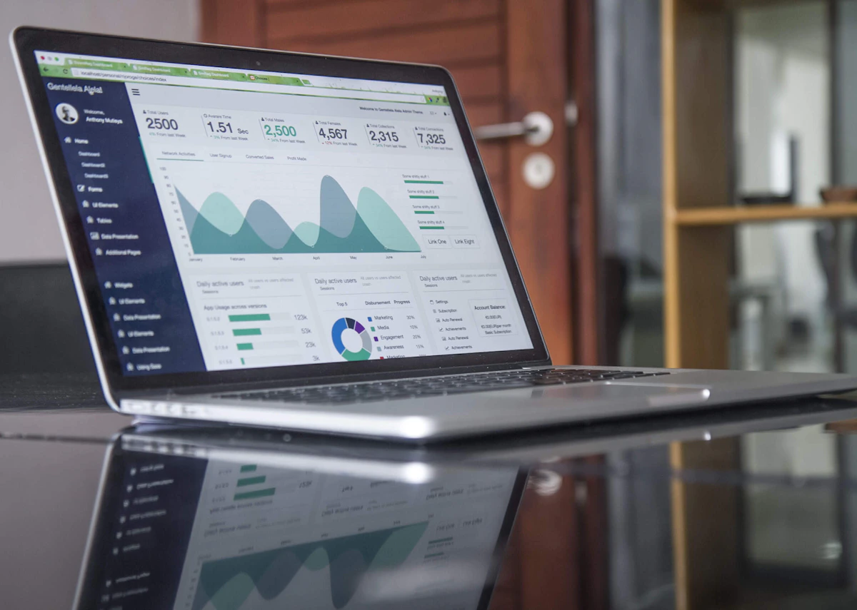
Attention should move toward the signal, not toward decorative chrome. The best dashboards use a quiet grid, purposeful contrast, and a small set of high-value metrics to create confidence in the system.
When every metric is rendered in bright gradients or dramatic 3D charts, users struggle to spot anomalies. Subtle neutral backgrounds allow key status indicators to communicate instantly.
“Premium software does not scream for attention. It earns trust through typography, calm data density, and effortless responsiveness.”— Strategic Takeaway
2. The power of typographic scale
Numbers are the heroes of dashboards. Clean tabular figures, consistent alignment, and disciplined type hierarchies allow power users to digest complex datasets in seconds.
Pairing a distinct display typeface for KPIs with an ultra-clean sans-serif for labels creates an immediate sense of editorial authority.
3. Fluid speed and micro-interactions
A premium interface feels instantaneous. Sub-second filter updates, seamless table pagination, and smooth state transitions reinforce the feeling that the product is a finely tuned precision instrument.
Principles for deliberate execution
- 1Design for high signal-to-noise ratio rather than decorative charts.
- 2Keep metric hierarchies restrained and predictable across views.
- 3Micro-latency in data filtering builds palpable user confidence.


